GUIDE / COLOPHON / FULL DISCLOSURE
How this
specimen was built
TONNE and MASS are fictional — a brand invented for this demonstration. Everything else on the page is real: real variable fonts, real OpenType features, real scroll physics. Here is the honest recipe.
01Concept
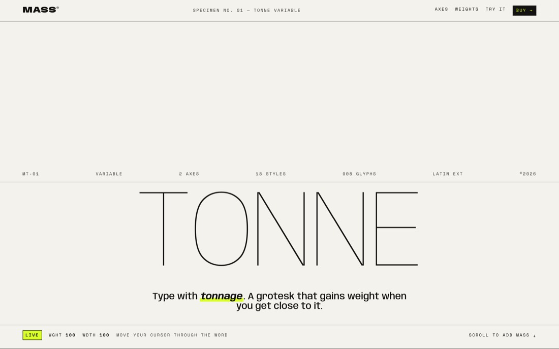
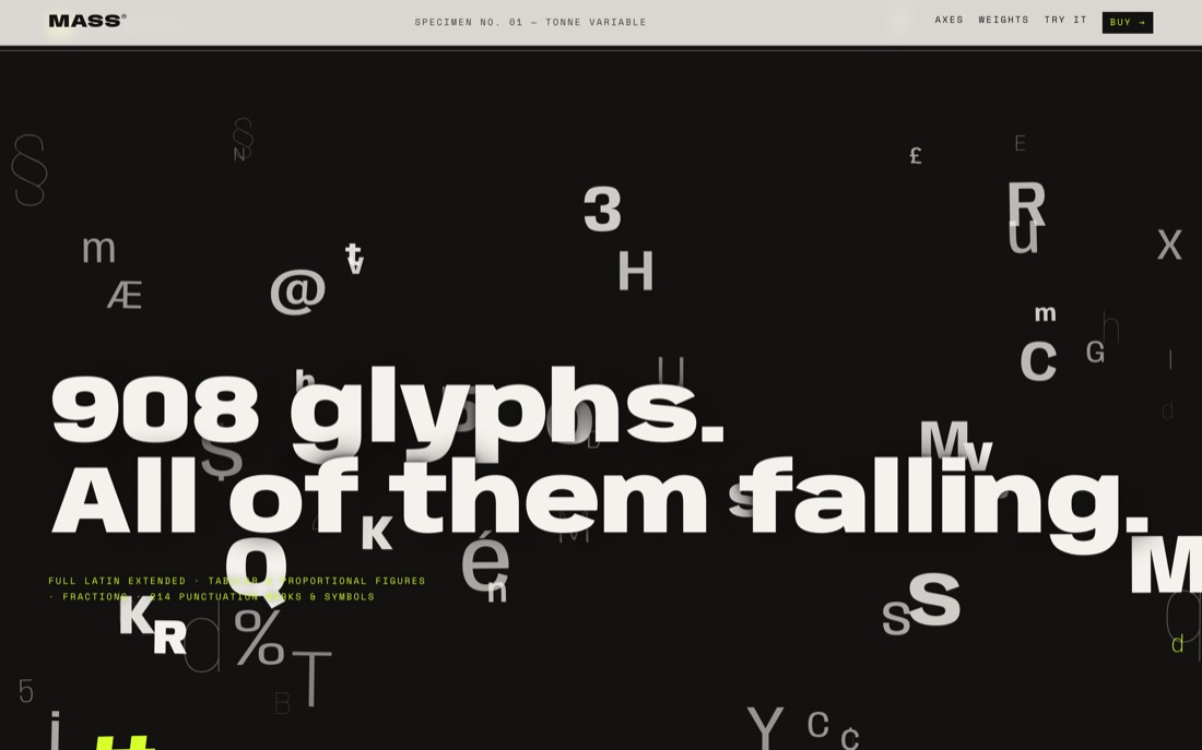
The brief: a type specimen where the typeface is the interface. Instead of pictures of type, the type itself performs — gaining weight near your cursor, traversing its design space as you scroll, falling as rain, and submitting to your drag in a live playground. One conceit organizes everything: mass. Weights are named after materials (Paper to Tungsten), heavy glyphs fall faster in the waterfall, and the scroll literally “adds mass.”
02Techniques
- Variable fonts, served honestly. “Tonne” is Anybody (ETC / Tyler Finck), a true two-axis variable font —
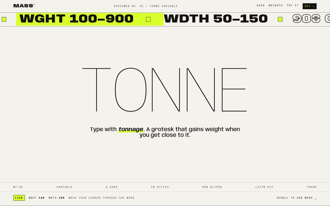
wght 100–900,wdth 50–150— loaded as a single woff2 from the @fontsource CDN on jsDelivr. “Tonne Serif” is Fraunces (its SOFT and WONK axes drive the pull-quote). Labels are Space Mono. - Cursor-proximity distortion. Each hero letter is a span; a
requestAnimationFrameloop measures its distance to the pointer, smoothsteps it into a weight target, and easesfont-variation-settingstoward it every frame. - Scroll choreography. GSAP ScrollTrigger scrubs the pinned design-space scene (weight 100→900, then width 150→50→150 with a live HUD), staggers the manifesto words, and loads mass into the giant footer word.
- Canvas glyph rain. A plain 2D canvas draws ~100 falling glyphs; each one’s CSS font string carries a random numeric weight, so the rain samples the whole variable axis. Heavier glyphs fall faster.
- Live OpenType. The
tnumandfracswitches toggle real features shipped in the font — no images, no fakery. - Respectful motion.
prefers-reduced-motionfreezes every loop into a considered static composition.
03Process
Built autonomously in three verification passes. Each pass: serve locally, screenshot desktop and 390px mobile with headless Chromium, actually read the images, log every console error and failed request, then write a harsh self-critique of at least five concrete flaws and fix them. Pass one established structure and killed font-loading races; pass two tightened spacing rhythm, contrast and the mobile cut; pass three polished motion timing and this guide.
04Prompt it yourself
To get an AI agent to build something like this, be specific about the physics, not just the vibe: